It is often best for fulfiller users to have a synergized experience across their tenant's entire suite of platforms and applications, which is created by visuals such as branded logos and matching color schemes. This can be achieved in the Fulfiller Interface of the Kibo Composable Commerce Platform (KCCP) by configuring a theme that includes custom assets to re-skin the appearance of the interface, including the modals and other elements for processing returns.
This guide provides a step-by-step walkthrough to customize the fulfiller application for a more personalized user experience.
Customizable Elements
The below elements of the interface can be customized to enhance the fulfiller user experience. However, it is good idea to discuss customization changes and field displays with the Kibo project team first in case supporting code changes are required for your implementation.
- Logo: The logo that gets displayed on fulfiller hamburger menu. This allows maintaining the same branding experience across the platform.
- Color Scheme: The background colors of grid headers, popups, section headers, and other elements. However, font size and font family cannot be changed.
- Localization: Labels are displayed based on language-specific resource files. To change the text of buttons, grid headers, section headers, or other elements, edit the resource keys in the localization files.
- Field Display: Language files can also be leveraged to hide or show certain fields. A common use for this is the flag that determines whether to display the External Order Number field in order data. This field is hidden by default in the tenant settings via
displayExternalOrderId, which is set to 0 by default. Changing this option to "1" would toggle the order number on.- Another example is the Return Status column that is usually displayed in shipment details. If your implementation does not process returns in the Fulfiller UI, you can toggle this column off with the
displayReturnsSectionsetting. In most cases such as these, a value of 1 will display the field while a value of 0 will hide it.
- Another example is the Return Status column that is usually displayed in shipment details. If your implementation does not process returns in the Fulfiller UI, you can toggle this column off with the
- Search Results Sort: You can configure the Fulfiller UI's default sorting order of search results so that users will view either the most relevant, most recent, or other preferred shipments first. In the tenant settings of a language file, set
searchShipmentSortByto orderFirst, orderLast, newest, oldest, highestCost, or lowestCost.
Development Environment
You will need a command line interface, Node.js, Grunt.js, and Git. This software is required in order to build and manage the theme files that are used for customization.
Additionally, Visual Studio Code should be installed. This is a lightweight but powerful source code editor which runs on the desktop and is available for Windows, macOS and Linux. It comes with built-in support for JavaScript, Typescript, and Node.js, and has a rich ecosystem of extensions for other languages (such as C++, C#, Java, Python, PHP, Go) and runtimes (such as .NET and Unity).
Note that access to a provisioned sandbox is required through a Dev Center account.
Creating a Theme
To begin creating a theme:
- In the Dev Center Console, click Develop > Themes.
- Click Create Theme.
- In the dialog box that appears, specify the Name and ID.
- Click Save. You should now see your theme in the Themes grid.
- Double-click your new theme to edit it.
- Note the Application Key. You will need this value later in the tutorial.

Configuring Assets
In the new theme, follow the below steps to create the configuration file:
- Create a file called "mozu.config.json" in the root of the theme folder. Configure it as shown in the below code block.
- To find your developer account ID, click Launchpad under your user name in Dev Center, and then hover over the link to the account you want to access. You should see your developer account ID appended to the URL, typically as a four-digit number.
- Replace the
workingApplicationKeyvalue with the Application Key value that you noted when creating the theme.
{
  "baseUrl": "https://t00000.sandbox.mozu.com",
  "developerAccountId": yourDevAccountId,
  "developerAccount": {
    "emailAddress": "yourDevEmailAddress"
  },
  "workingApplicationKey": "yourPackageApplicationKey"
}
Customizing Assets
Now you are ready to begin customizing. The structure and assets of the new theme can be based on existing repositories that Kibo provides as templates, so you can clone those and make changes that will be uploaded to your new theme in Dev Center.
- If you are customizing the general UI, clone the fulfiller theme repository to a local folder. If you are customizing the returns part of the UI, clone the returns theme repository instead.
- Open the cloned local folder in Visual Studio Code.
- Open the Terminal window of Visual Studio Code. Usually this window should be open by default and displayed in the bottom half of Visual Studio Code. If not displayed, click Terminal > New Terminal in the menu to launch a new window.
Both the fulfiller and returns themes share a similar hierarchy, in which theme assets such as logos and CSS variables are accessible under the root fulfiller or returns folder depending on which repository you are using. The languages subfolder contains the language files that support custom language localization and field display.
You can make the following changes to customize the theme:
- Ensure that the config.json file from the repository exists in your new theme.
- Replace the logo.png file with the appropriate image, though the file name and the extension must remain the same.
- Open the variables.css file and make changes to the CSS styling for the user interface and its color scheme. For example, replacing
--dashboard-active-tab-background-color: #c73916;with--dashboard-active-tab-background-color: #56ba77;would change the dashboard active tab's background from red to green. - The language localization files bind static text in the UI to string variables. To change any of the text, make edits to the values of these variables in the appropriate language file (such as fr.json for French). For example, changing the
"lateShipments": "Late Shipments"field in the section for dashboard grid tabs with"lateShipments": "Delayed Shipments"would cause the UI to display "Delayed Shipments" where that label appears on the dashboard.
The structure of the variables.css file must remain the same, so make sure to keep :root { as the first line in the file. If you remove this line, then the customized variables will not be loaded.
Edited assets must be pasted into the theme at resources > admin > fulfiller or resources > admin > returns. Then, it is ready to be applied to a sandbox.
Custom Language Localization
Recall that the fulfiller > languages and returns > languages subfolders contain language files that allow localization of the Fulfiller UI. If the language you want to use is not included by default, you can upload additional files for other languages that you want to support.
You must upload a language file to both the fulfiller and returns subfolders to fully translate both elements of the Fulfiller UI. These files should use the same template as the existing en.json and fr.json files, but with the string values translated into your chosen language. The name of the files must be the locale code, such as de.json (German), otherwise it will not be usable and the UI will default to English.
Once these language files exist for the user’s browser language, then the Fulfiller UI and return menus will automatically be displayed in that language.
Shipping Label Orientation
You can override the default shipping label orientation for specific carriers by defining the orientation, CSS style, width, and/or height in the theme. Supported orientation values are Landscape, Portrait, RotateRightPortrait, RotateLeftPortrait, Default, and Custom.
Locate the shippingLabelOrientationsForCarrier tenant setting and configure the settings for each carrier in the array, such as in the below example. The "Custom" carrier refers to those integrated with shipping extensibility.
"shippingLabelOrientationsForCarrier": [
        {
          "carrier": "UPS",
          "orientation": "Default"
        },
        {
          "carrier": "FedEx",
          "orientation": "Default"
        },
        {
          "carrier": "Purolator",
          "orientation": "Default",
          "style": "page-break-after: always;text-align: center;",
          "width": "80%",
          "height": "50%"
        },
        {
          "carrier": "Custom",
          "orientation": "Default"
        }
      ]
Publishing Changes
The new theme must be built, published, applied to the tenant, and tested to ensure it displays properly. Make sure that your final theme in Dev Center includes both your customized clone and the configuration file that you created before.
- In the terminal window, type
grunt build –forceand check for a successful build message. - Once the build is successful, publish the customized theme to the Dev Center by typing the command
grunt mozusync:uploadand then authorizing with your password. This will upload all the customizations to the Dev Center. - To apply it to a tenant, it must be installed on a sandbox. You only need to do this once. After installation, your theme remains installed on the sandbox until you remove it.
- In the theme toolbar at the top right, click Install.
- In the Select a Tenant dialog box, select the sandbox you previously created.
- Click OK.
- Then you can apply it to a site from the Admin UI.
- In the Admin UI, Go to Main > Content > Themes.
- Select the appropriate site in the header.
- Click the three dots to the right of the theme to expand the action menu and click Apply.
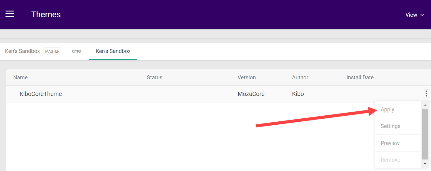
- You can view either the live or staged versions of this theme with the View button in the top right.

Kibo recommends applying any theme customizations to all of your sites. This is because the Fulfiller UI cannot distinguish between sites except when viewing shipment details, so the default site's theme is always used on the dashboard or any other page where there isn't a specific shipment to reference.