
- Step 1: Add a React component file
- Step 2: Register the component
- Step 3: Ensure the group matches the one registered
- Step 4: Open the editor to verify the component appears in the chosen group
Overview
- Custom components live in the
src/editorComponentsfolder and are provided to the renderer viaeditorComponentsexported fromsrc/editorComponents/index.tsx. - The page renderer (
src/components/DocumentRenderer.tsx) passeseditorComponentstoDocumentRendererfrom@webiny/website-builder-nextjs. - Component groups (used in the editor UI) are registered in
src/contentSdk/initializeContentSdk.tsusingregisterComponentGroup.
Files to inspect
src/editorComponents/index.tsx— the central list of editor components and input definitionssrc/components/DocumentRenderer.tsx— how components are provided to the renderersrc/contentSdk/initializeContentSdk.ts— where component groups are registered
Step-by-step: Create a new custom component
Step 1: Add a React component file
Add a React component file undersrc/editorComponents (or a subfolder). In this tutorial we will create CalloutBox component.
- Prefer exporting a named component (e.g.
export const CalloutBox = () => { ... }). - Keep the component as a standard React functional component.
src/editorComponents/CalloutBox.tsx
Step 2: Register the component
Define editor inputs and register the component insrc/editorComponents/index.tsx.
- Use
createComponentfrom@webiny/website-builder-nextjsto register the component withname,label,groupandinputs. - Use input helpers such as
createTextInput,createLongTextInput,createLexicalInput,createFileInput,createSelectInput,createSlotInput.
src/editorComponents/index.tsx):
- The
nameproperty defines the unique editor identifier (used by the editor to save/load the block). - The
groupshould match a component group registered insrc/contentSdk/initializeContentSdk(e.g.,custom,basic).
- When the editor renders the page, the
DocumentRendererwill render your component and pass the block data as props. - Typical convention: input names map to prop names. For example,
titlebecomesprops.titleinside your component. - For slot inputs (
createSlotInput) the renderer will pass an array of nested blocks which you should render usingchildrenor a dedicated renderer.
Step 3: Ensure the group matches the one registered
- Component groups (editor categories) are registered in
src/contentSdk/initializeContentSdk.tswithregisterComponentGroup. - Pick an existing group (
basic,sample) or add a new one ininitializeContentSdk.ts.
Demo Group add the following to initializeContentSdk.ts:
- Keep components presentation-focused; prefer receiving plain data from inputs rather than coupling to editor APIs inside the component.
-
For rich text, prefer
createLexicalInputwhere content is saved as Lexical nodes and will be rendered byDocumentRenderer. -
Use
createSlotInputto allow nesting arbitrary content inside your block. - Keep components SSR-friendly. Use client-only code (like browser-only libs) inside a child component or guarded by dynamic import to avoid SSR issues.
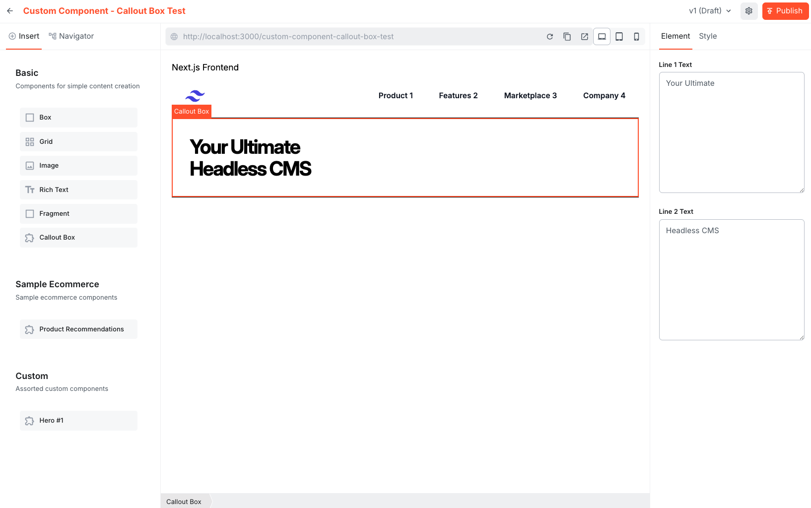
Step 4: Open the editor to verify the component appears in the chosen group and that it is functional.
- Run the site and open a new Page in the editor to verify the component appears in the chosen group.
- Drag and drop the new component in the Page to validate it is functional.