> ## Documentation Index
> Fetch the complete documentation index at: https://docs.kibocommerce.com/llms.txt
> Use this file to discover all available pages before exploring further.
# Custom Components
> Learn how to add custom components in the Next.js starter kit with Kibo CMS Website Builder.
In this tutorial, we explain how to create, register and use custom components in this Kibo CMS Website Builder project.
* Step 1: Add a React component file
* Step 2: Register the component
* Step 3: Ensure the group matches the one registered
* Step 4: Open the editor to verify the component appears in the chosen group
## Overview
* Custom components live in the `src/editorComponents` folder and are provided to the renderer via `editorComponents` exported from `src/editorComponents/index.tsx`.
* The page renderer (`src/components/DocumentRenderer.tsx`) passes `editorComponents` to `DocumentRenderer` from `@webiny/website-builder-nextjs`.
* Component groups (used in the editor UI) are registered in `src/contentSdk/initializeContentSdk.ts` using `registerComponentGroup`.
## Files to inspect
* `src/editorComponents/index.tsx` — the central list of editor components and input definitions
* `src/components/DocumentRenderer.tsx` — how components are provided to the renderer
* `src/contentSdk/initializeContentSdk.ts` — where component groups are registered
## Step-by-step: Create a new custom component
### Step 1: Add a React component file
Add a React component file under `src/editorComponents` (or a subfolder). In this tutorial we will create `CalloutBox` component.
* Prefer exporting a named component (e.g. `export const CalloutBox = () => { ... }`).
* Keep the component as a standard React functional component.
Example minimal component:
```diff-tsx src/editorComponents/CalloutBox.tsx theme={null}
"use client"
import type { ComponentProps } from "@webiny/website-builder-nextjs";
interface LineProps {
text: string
highlighted: boolean
breakAfter?: boolean
}
type CalloutBoxProps = ComponentProps<{
"line-1": string
"line-2": string
style: 'default' | "primary"
}>
export function CalloutBox({ inputs }: CalloutBoxProps) {
const lines = [
{ text: inputs['line-1'], highlighted: true },
{ text: inputs['line-2'], highlighted: false },
];
return (
{lines.map((line, index) => {
return (
{line.text}
)
})}
)
}
```
### Step 2: Register the component
Define editor inputs and register the component in `src/editorComponents/index.tsx`.
* Use `createComponent` from `@webiny/website-builder-nextjs` to register the component with `name`, `label`, `group` and `inputs`.
* Use input helpers such as `createTextInput`, `createLongTextInput`, `createLexicalInput`, `createFileInput`, `createSelectInput`, `createSlotInput`.
Example registration snippet (add to `src/editorComponents/index.tsx`):
```tsx theme={null}
import {
createComponent,
createTextInput,
createLongTextInput
} from "@webiny/website-builder-nextjs";
import {CalloutBox} from "./CalloutBox";
createComponent(CalloutBox, {
name: "Webiny/CalloutBox",
label: "Callout Box",
group: "basic",
inputs: [
createLongTextInput({
name: "line-1",
label: "Line 1 Text",
defaultValue: "Your Ultimate",
required: true
}),
createLongTextInput({
name: "line-2",
label: "Line 2 Text",
defaultValue: "Headless CMS",
required: true
})
]
}),
```
Notes:
* The `name` property defines the unique editor identifier (used by the editor to save/load the block).
* The `group` should match a component group registered in `src/contentSdk/initializeContentSdk` (e.g., `custom`, `basic`).
**How inputs map to component props**
* When the editor renders the page, the `DocumentRenderer` will render your component and pass the block data as props.
* Typical convention: input names map to prop names. For example, `title` becomes `props.title` inside your component.
* For slot inputs (`createSlotInput`) the renderer will pass an array of nested blocks which you should render using `children` or a dedicated renderer.
### Step 3: Ensure the group matches the one registered
* Component groups (editor categories) are registered in `src/contentSdk/initializeContentSdk.ts` with `registerComponentGroup`.
* Pick an existing group (`basic`, `sample`) or add a new one in `initializeContentSdk.ts`.
In this tutorial, we used an existing group, but if you need to create a new one, for example, a new `Demo Group` add the following to `initializeContentSdk.ts`:
```tsx theme={null}
registerComponentGroup({
name: "demo",
label: "Demo Group",
description: "Demo components"
});
```
Note: the order in which the Component groups show in the Kibo CMS Website Builder depends on the order in which they were added to the file above.
* Keep components presentation-focused; prefer receiving plain data from inputs rather than coupling to editor APIs inside the component.
* For rich text, prefer `createLexicalInput` where content is saved as Lexical nodes and will be rendered by `DocumentRenderer`.
* Use `createSlotInput` to allow nesting arbitrary content inside your block.
* Keep components SSR-friendly. Use client-only code (like browser-only libs) inside a child component or guarded by dynamic import to avoid SSR issues.
### Step 4: Open the editor to verify the component appears in the chosen group and that it is functional.
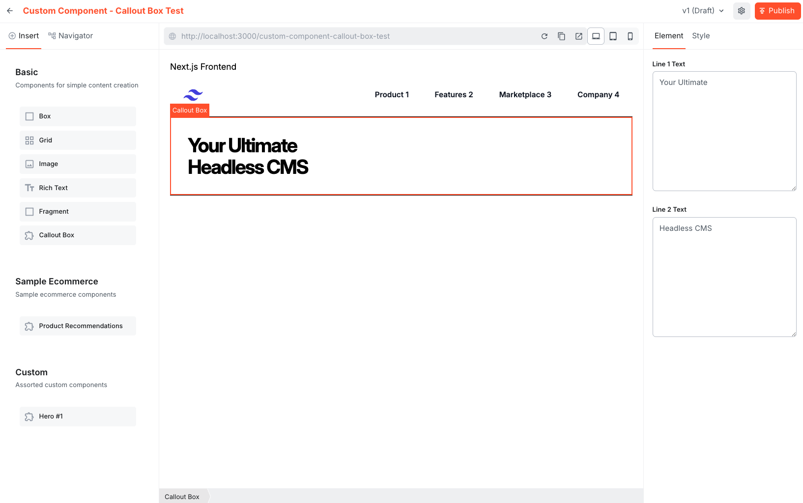
* Run the site and open a new Page in the editor to verify the component appears in the chosen group.
* Drag and drop the new component in the Page to validate it is functional.